Designing Enterprise-Scale Notifications for Microsoft's VL Central
Client.
Microsoft
Tools.
Figma
Year.
2022
Role.
Product Designer
Background
Microsoft licenses Office 365 in bulk to enterprise customers, with discounted pricing and enterprise support. Before modernization, Microsoft and its partners managed this high-volume licensing process using 30+ disconnected tools, many of them legacy systems. The result was fragmented workflows, slow approvals, and an average turnaround time of 53 days, more than twice what competitors delivered.

To fix this, Microsoft launched VL Central, a unified platform built to consolidate tools, streamline workflows, and reduce delays across the licensing ecosystem.
My Role
I was responsible for designing three key modules within VL Central:
Notifications
Agreement to Invoice
Organization Details Management
Working alongside a peer designer and guided by a Principal Designer, I collaborated with architects, product owners, developers, and stakeholders throughout the process from discovery to design sign-off. My focus was on ensuring solutions were user-centered, technically feasible, and aligned with business goals.
This case study focuses specifically on the Notifications module.
Problem
Users struggled with notifications because the legacy tools in the Office 365 Volume Licensing ecosystem each had their own notification mechanisms. Some tools offered in-app notifications, others relied solely on email, and a few provided no notifications at all. This fragmented setup made it difficult for users to stay informed and act efficiently.
User challenges (before consolidation):
"I don’t have time to check every tool. I rely on email." - 9/12 Participants
"I get copied into deals that aren’t mine. It’s hard to focus." - 8/12 Participants
"Everything looks the same. I can’t tell what’s important." - 5/12 Participants
“I’m always on the move. I need updates on my phone." - 4/12 Participants
Notifications were overwhelming, often irrelevant, and inconsistent in delivery. Users defaulted to email not out of preference but because it was the only reliable channel. These challenges highlighted the need for a centralized notification system that could unify messages, reduce noise, and ensure actionable updates reached the right users.
Expected system-level challenges (after consolidation):
When consolidating 30+ tools into a single platform, several technical considerations were anticipated:
High notification volume
Inconsistent metadata across APIs
Duplication management
Scalability and performance
Addressing these expected challenges meant designing a system that was both user-friendly and technically robust, ensuring notifications were relevant, actionable, and scalable across all channels.
Solution
Our goal was to create a notification system that was intuitive, role-aware, and scalable, capable of delivering relevant updates across multiple channels. We approached the redesign in layers, addressing user clarity, prioritization, and system reliability simultaneously.
1. Understanding Notification Scenarios and Centralizing Communication
We began by mapping all notification types and workflows across the legacy ecosystem. Each notification was evaluated for purpose, audience, and the most effective delivery channel, whether in-app, email, or both.

A centralized notification hub was then designed, consolidating scattered updates into a single view. Centralization alone was not enough; notifications also needed structure, relevance, and consistency.
We introduced a classification system to make notifications actionable and predictable:
Source: Originating tool or system
Type: Action required, informational, or announcement
Channel: In-app, email, or both
Urgency: Time-critical or routine

This framework became the backbone of a scalable and organized system, ensuring critical updates reached users immediately while low-priority notifications remained unobtrusive.
Collaboration with developers
Defined which metadata could be consistently captured and displayed
Aligned real-time API responses with UI needs to ensure smooth performance
Coordinated deduplication and filtering logic to handle high notification volumes
2. Designing a Clear and Actionable Interface
To help users distinguish between routine and urgent updates, I extended the existing design system with:
Visual urgency cues
Consistent iconography
Clear timestamps and source labels
Inline action prompts
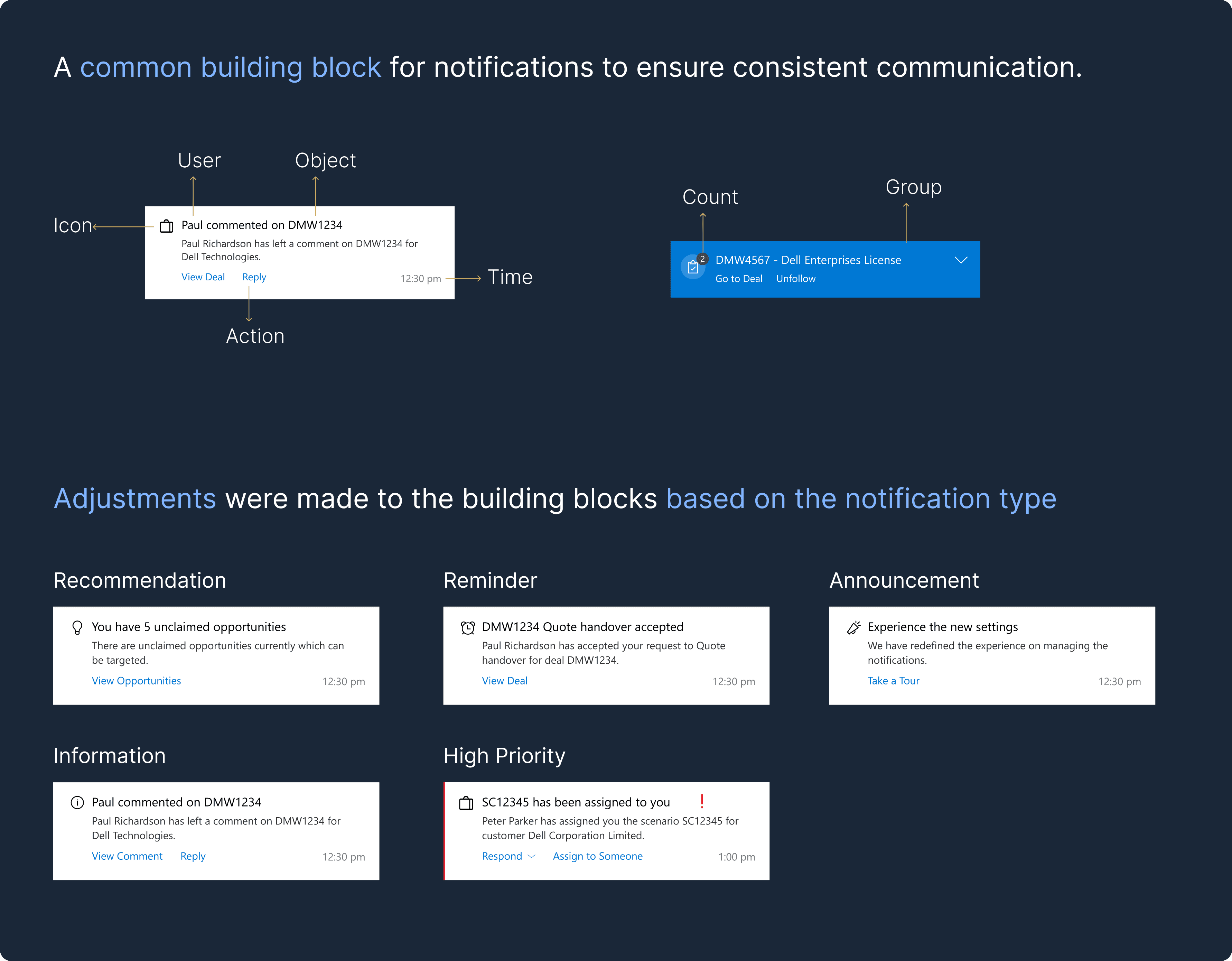
Notifications were organized into two main categories based on current volume distribution:
Focused (70 percent of total notifications): Updates that required attention, including:
Actions (15 percent): Critical tasks that users needed to approve, reject, or assign
Deal-related information (55 percent): Updates tied to specific deals that did not require immediate action but were important for workflow context
Announcements (30 percent): Informational notifications that were not tied to any specific deal, such as system updates or general news
Users could filter updates by workspace or type, see unread counts, and act directly from the notification itself without leaving the panel. The Notification Dashboard allowed searching, filtering, and browsing archived messages, making it easy to track past updates.
Collaboration with developers:
Determined which actions and deal-related information could be executed or displayed inline based on backend capabilities
Optimized search and assignment features for performance and responsiveness
Ensured updates reflected accurately across all interfaces in real time
3. Ensuring Relevant, Role-Based Delivery
To reduce irrelevant notifications, we defined scenario-specific rules: triggers, recipients, timing, and channels.
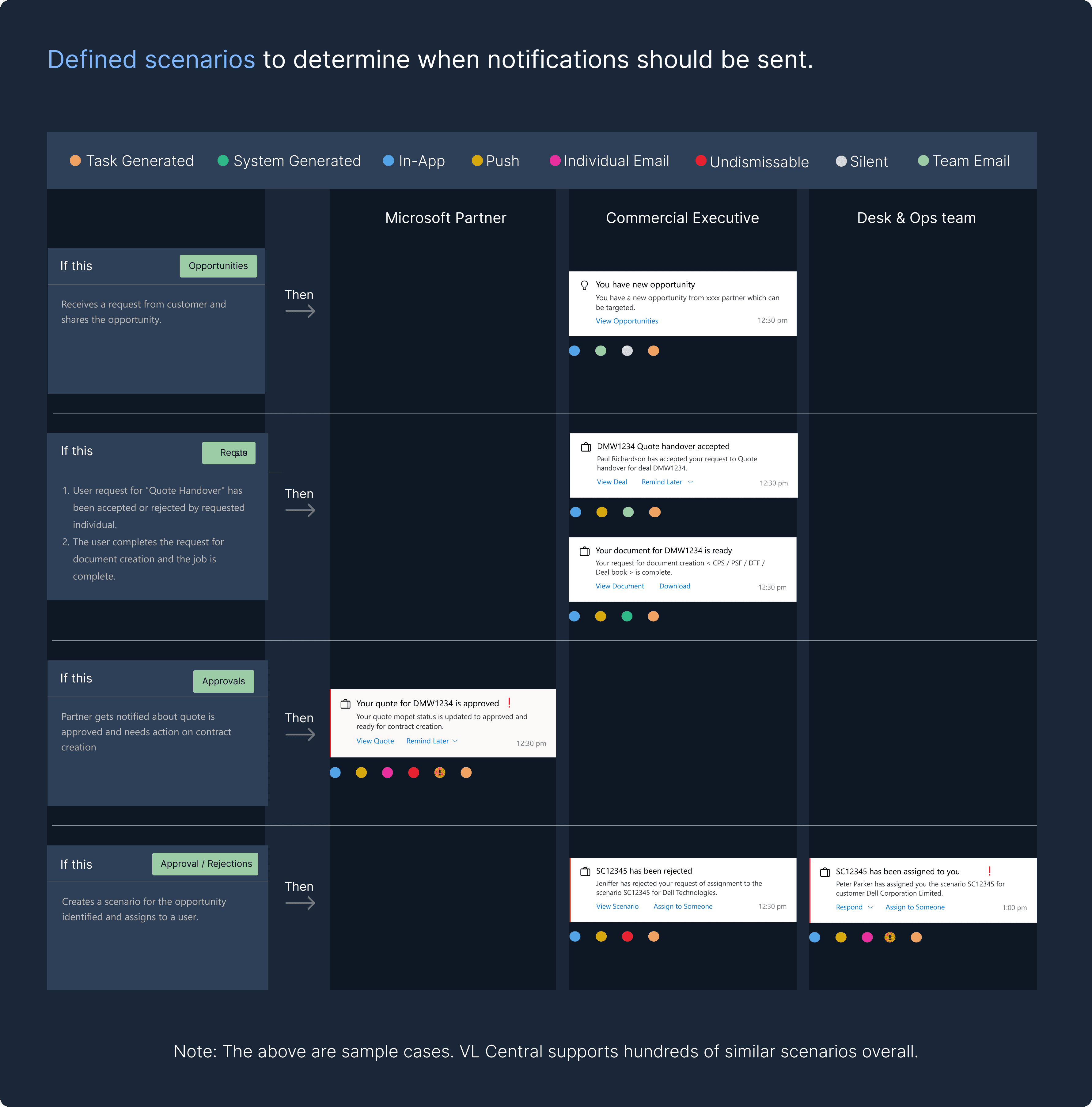
These rules were mapped to roles like Microsoft Partners, Commercial Executives, and Desk Operations, ensuring context-sensitive delivery.
We also introduced powerful controls:
a) Users could group notifications by client or company and unfollow specific threads to stop receiving updates from irrelevant deals.
b) Preferences could be customized, letting users choose channels, scenarios, and whether they wanted announcements
This gave users complete control over their notification experience.
4. Extending Beyond Desktop
Since many users accessed notifications on mobile, we:
Created mobile-optimized emails and responsive templates
Enabled inline actions without requiring login
Integrated delivery through Teams and SMS
Built fallback mechanisms to ensure messages were received even if one channel failed
This ensured users stayed informed anywhere, anytime, while keeping the system efficient and scalable.
Impact
This redesign went beyond cleanup. It rebuilt confidence in how licensing updates were received and acted upon.
Measurable Impact:
42% reduction in notification overload through role- and scenario-based logic
58% faster response times to critical actions thanks to prioritization and inline actions
70% drop in email volume by removing redundant and low-priority updates